Increase Your Conversions
Increasing your conversion rates is absolutely crucial. Having a good conversion rate is the foundation of high sales volume.
First things first: Your website needs a goal
When I review websites, I ask people about their #1 business goal – the main action they want people to take on their site.
Why? You can only evaluate a website against a goal – how effective is it in achieving it? If you don’t have a goal, there is no way to improve the site. You can only improve what you can measure.
Some people tell me their goal is for people to “read about their products.” No. That is not a business goal. A goal you should go after is an action other than reading: sign-up, purchase, clicking something, ordering something.
If your goal is for people to read the text on your site, you need a new goal.
13 Ways You Can Increase Your Conversation Rate Right Now
1. Do A/B testing
In real estate it’s about location, location, location. In conversion optimization, it’s testing, testing, testing. Experimentation is the best way to mitigate risk in decision making while allowing your creative teams room for innovation and exploration of new opportunities.
Wait! What’s A/B testing in the first place?
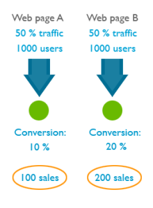 A/B testing (or split testing) is a technique for increasing your website’s conversion rate (that’s its ability to turn visitors into customers). If you had two possible headlines for your page and you couldn’t decide which to use, you could run an A/B split test to see which one works better.
You create two alternative versions of your page (page A and page B), each with a different headline. A/B testing software directs 50% of the incoming traffic to page A and 50% to page B. Both pages have a call to action, and in the end you count how many people took the action.
The page with more conversions (more people taking action) wins.
Your goal should be to have at least one, and preferably several A/B tests running at any given time on your site. There’s no such thing as “perfect” when it comes to marketing, your website, or product design, and the only way you learn about what works and doesn’t work is to continually test.
2. Create a compelling and clear value proposition
The potential of your conversion rate is determined by the value proposition, making it the most important conversion factor.
What exactly is a value proposition?
It’s the primary reason a prospect should buy from you. Customers not only want to know “What’s in it for me?” but “Why buy from you?”
If you had just 10 words to explain why people should buy from you instead of the competition, what would you say?
Many marketers try to improve results by changing page elements like font colors and sizes, button shapes, images, incentives, and so on, when the first step should really be focusing on strengthening their value propositions.
If your home page or the product page says “Welcome!” or lists just the name of your company or the product, you’re missing out. Note that there is a difference between the value proposition for your company and your product. You must address both.
What makes a good value proposition?
- It must be differentiated from your competitors’ offers.
- You may match a competitor on every dimension of value except one. You need to excel in at least one element of value (key important factor for the buyer).
Crafting a value proposition requires substantial reflection on what is unique about your company and your products and services. Having a powerful value proposition is not enough; it must be communicated effectively to achieve optimal results. You need to refine your value proposition until you can articulate it in a single, instantly credible sentence.
However hard you work on expressing your value proposition, to know its true effectiveness you must test to see how it resonates with your ideal prospect. Optimizing value propositions is a continual process that involves identifying, expressing, and testing/measuring. Use A/B testing to do it.
3. Set up a sales funnel
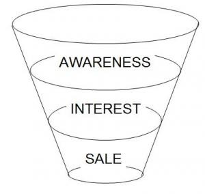
Sometimes what kills your conversions is that you’re asking for the sale (signup, whatever) too fast. People might be “just browsing,” not be psychologically ready or not in a hurry to buy right now.
The more expensive and/or complicated the product, the more time people need before they’re ready to commit.
As I mentioned earlier, for software products sometimes offering a demo or a free trial instead of asking for a signup or purchase can bring significant improvement in conversions. But in many cases you need to just slow down and build a sales funnel to build trust, develop relationship and prove your expertise.
Let’s say your product is an online course on DIY home repair. Here’s how you should go about it.
What the visitor wants
- To learn about DIY home repair
What you want
- Get the visitor to buy your course
How to do it
- Offer valuable free home repair advice via your blog, videos, free reports, whitepapers
- Become their trusted advisor
- Give them compelling reasons to sign up to your email list (in exchange for some good info)
- Free drip content video course via email
- Send them to your sales copy and ask for the sale
Some people say it takes at least 7 contacts with a prospective buyer before they’re ready to buy from you. I haven’t seen any recent research to back this up, but I know for a fact that the longer and deeper your relationship with the prospect, the more likely they are to buy from you.
So slow down. Offer value and results in advance, way before asking for the sale. Just capture their email address so you can continue talking to them and bringing them closer to the point of purchase.
4. Cut the jargon
 Clarity trumps persuasion, always.
Recently I came upon a site with the following value proposition:
“Revenue-focused marketing automation & sales effectiveness solutions unleash collaboration throughout the revenue cycle”
What does it mean? Can you now explain what they do and how is it useful to you? Not really, right?
Do not try to woo people with fancy, complicated business language – it just doesn’t work.
You write for people – it’s people who read your site. Marketing directors and Purchasing Managers are people too. Don’t write for companies, write for people.
Clarity is something that I see marketers constantly struggling with. The best way to re-phrase all of the marketing speak on your site is to imagine you’re explaining your product to your close friend. If there’s a sentence worded in a way that you wouldn’t use in a conversation with a friend, re-word it. As Paul Graham said, “write like you talk.”
5. Address objections
Whenever people read your offer, there will be friction. They’ll have some conscious and sub-conscious objections to what you’re saying and hesitations about taking the offer.
During in-person sales, we can uncover those hesitations with questions and address the concerns, but online it’s more difficult. The solution is to prevent those objects by addressing all the possible issues in your sales copy right away.
Step one – create a list of all the possible hesitations and objections your potential customers might have. Step two, add info to your sales copy to eliminate or alleviate those concerns. The list can contains things like:
- You don’t understand my problem (explain the problems your product solves)
- Why should I believe you? (show off your credentials, experience, awards etc)
- What if it doesn’t work on me? (have testimonials of all kinds of users that have benefited from your product)
- It’s not worth the money, there are cheaper alternatives out there (explain your price, compare with the competition, prove the value your product offers)
…and so on. It’s important to come up with as long list as you can. Seek external input, do user testing and ask your customers to figure out what all they might be concerned about.
Bonus tip: use on-site surveys to pinpoint visitor frustrations. This way you can get real feedback from actual visitors in real-time, while they are experiencing your website. Read this article to learn more.
6. Increase trust
 Let’s say you walk down the street, and some random dude comes up to you. “Hey, wanna buy an iPad? Just $50. It’s brand new.” Would you buy it?
You know the product is good. You know it’s a really good deal. But you probably wouldn’t still buy it. Why? Because you don’t trust him.
Sales guru Zig Ziglar once said that there are only 4 reasons why people won’t buy from you:
- no need,
- no money
- not in a hurry
- no trust.
We can’t do much about the first 3 reasons, but we can build trust. Add trust elements to your website and see your conversions increase.
So what makes people trust a website? The good thing is that Stanford Persuasive Technology Lab has studied this over the years and has the answer.
Here’s the list, make sure your website has all of the items present:
- Make it easy to verify the accuracy of the information on your site. You can build web site credibility by providing third-party support (citations, testimonials, articles in well-known publications, source material) for information you present, especially if you link to this evidence. Even if people don’t follow these links, you’ve shown confidence in your material.
- Show that there’s a real organization behind your site. The easiest way to do this is by listing a physical address. Other features can also help, such as posting a photo of your offices or listing a membership with the chamber of commerce.
- Highlight the expertise in your organization and in the content and services you provide. Do you have experts on your team? Are your contributors or service providers authorities? Be sure to give their credentials. Are you affiliated with a respected organization? Make that clear. Conversely, don’t link to outside sites that are not credible. Your site becomes less credible by association.
- Show that honest and trustworthy people stand behind your site. Find a way to convey their trustworthiness through images or text. Post employee photos and bios that tell about family or hobbies.
- Make it easy to contact you. A simple way to boost your site’s credibility is by making your contact information clear: phone number, physical address, and email address.
- Design your site so it looks professional (or appropriate for your purpose). People quickly evaluate a site by visual design alone. When designing your site, pay attention to layout, typography, images, consistency issues, and more. Amateur-looking websites kill trust, invest in a quality designer.
- Make your site easy to use – and useful. Research shows that sites win credibility points by being both easy to use and useful. Some site operators forget about users when they cater to their own company’s ego or try to show the dazzling things they can do with web technology.
- Update your site’s content often. People assign more credibility to sites that show they have been recently updated or reviewed. If you have a blog or a news section, make sure they’re updated regularly. Nothing says “out of business” like an abandoned blog.
- Use restraint with any promotional content (e.g., ads, offers). Nobody likes hype, popups and blinking banners. People associate it with scam and spam. If possible, avoid having ads on your site. If you must have ads, clearly distinguish the sponsored content from your own. As for writing style, try to be clear, direct, and sincere.
- Avoid errors of all types, no matter how small they seem. Spelling errors and broken links hurt a site’s credibility more than most people imagine. It’s also important to keep your site fast and functional.
7. Make it easy to buy from you
Make doing business with you as easy as possible. Your users should not have to figure out how to buy from you or where to click. It has to be intuitive and self-evident. As few clicks as possible.
Could your grandma figure out how to buy from your site within a minute or two?
- Tell your users what they should do next. In every page, always guide the user towards the action you want them to take. Make the primary next step look more important than other links.
- Do not give users too many options. The Paradox of Choice (a great book, by the way) states that the more choice you will give your users, the easier it is to choose nothing. Choice paralyzes. If you have a lot of products, build better filters, so your prospects could identify the right one for them without spending too much time.
- Ask to fill as few fields as possible. The more fields you have in your order or sign up form, the less people will fill it out. Add the option to sign up via their Facebook or Google account. Don’t ask for anything that you don’t absolutely need to know in order to fulfill the order.
- Do not force users to sign up in order to buy. Do you know the story of the 300 million dollar button? I suggest you read it. The main point: do NOT force people to sign up as a user in order to buy from you. Let them check out as a guest. It will make a world of difference.
- Offer free shipping. Free shipping was the most popular motivation for 82% of UK and 80% of US consumers in a study conducted by eConsultancy, and gives etailers that offer this option a clear advantage over competitors.
8. Communicate value

A common mistake marketers make is that they do not provide enough information about the products and services they sell.
Let’s take this chair, for instance. Let’s describe it like this (all true facts):
- Seat and back of breathable pellicle suspension material for long-term comfort.
- Weight: 51 pounds
- Color: Classic Carbon Pellicle
- Full 12-Year Manufacturer’s Warranty
Price: $869.
Would you pay $869 based on what I just listed here?
No, that would be ridiculous. Yet so many sites do exactly that (luckily the maker of this chair provides more info than that). They just list a bunch of bullet points with features along with the price.
The best way to sell products and services is to to add as much information about them as is possible. Pages and pages and pages, videos and images. It’s true that 79% of people won’t read it all, but 16% read everything! That 16% is your main target group.
If one reads all of the product info and is not convinced yet, you have a problem. But if one is convinced after reading just 1/4, they can skip the rest and just complete the purchase right away. Up to 50% of potential sales are lost due to inadequate information, says IDC, a global research company.
You need to provide enough information so that the prospect could convince themselves
Add pictures, videos, reviews to all of your products. Intelligent, neutral and benefit-oriented sales copy works the best. Take a look at Amazon – they manage to create sufficient content for most products they sell, and they sell millions of products.
Aah, and list the price AFTER you communicate the value. Otherwise people might make a snap judgement based on the price without reading the value it offers.
9. Offer proof
Whatever you claim, you need to back it up with proof. People are skeptical and they want to see the evidence.
So what kind of proof can you provide?
- Customer testimonials. People who used your products verify your claims. It’s a good idea to use testimonials from customers that were in a worse situation that the average customer. If even people in terrible circumstances could get the results, so can they!
- Case studies. We’ve all seen before and after type of case studies. Very effective when done well.
- The results of scientific tests and studies. I know a log home manufacturing company that wrestled with the claims that log homes lose a lot of heat in the winter and they’re expensive to keep up. They commissioned an independent study from a well-known university. The study found that the log homes are as energy efficient as any other kind of buildings. Now the manufacturer can refer to this study to back up their claims.
- Third-party reviews. Did a trade magazine or a blog write a glowing review? Show it off and link to it.
- Social proof. If you have thousands of customers, make it a well-known fact. Nobody wants to be the only idiot using your service. If you have thousands of people / companies use your service, can’t be all that bad!
- Show it! Nothing like a good demo to prove what your product does. Use videos that showcase your product in action.
Go over all the claims you make in your sales page and figure out how to add some proof.
10. Remove distractions
This is big. You want people to focus on a single action and not be distracted from it.
Are there items on the page that could divert the visitor away the from the goal?
The more visual inputs and action options your visitors has to process, the less likely they are to make a conversion decision. Minimizing distractions like unnecessary product options, links, and extraneous information will increase the conversion rate.
On your landing pages and product pages, remove or minimize everything that is not relevant to users taking action.
- Remove or shrink the menu.
- Get rid of sidebars and big headers.
- Take off irrelevant (stock) images.
- Think about removing navigation on landing pages.
Ask yourself is there anything else that you could take off page, something that is NOT contributing to the conversion?
11. Compare yourself with the competition before your visitors do
Every product and service has its competitors – direct and indirect. Research shows clearly that people do their homework before purchasing a product and compare among providers. It seldom happens that someone will buy your product without checking out your competition first.
Taking that into account, use it to your advantage – compare your products to competing products before users do.
People are lazy. More often people compare things without giving it a lot of thought – they just look at the price and main features. For example when choosing a web host they look at the server space and monthly payment and that’s it. You, as an expert in your field, know that actually many other things should be considered.
When it’s you doing the comparison, you can point out the things you feel are your biggest advantages over the alternatives. If your product is more expensive than others, then this is your chance to explain why.
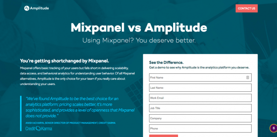
What if your competition is already doing it?
Imagine if your competitor is openly comparing your services and making it look like their offer is superior, and you don’t provide any information on why your product is better? A large number of people will take that competing offer.
Another benefit to adding product comparison pages to your website is that it can keep people from leaving your website. They can already do the comparison on your site, so why leave? It won’t keep all of them on your site, but you’ll definitely win over a good portion of visitors.
How to do the comparisons?
This depends on your product. If it’s a pure spec-based product like say, a laptop, you can compare the specs (battery life, disk space, RAM etc) in a traditional table. If your product is more complex, use a more descriptive comparison.
If some of the specs are lower than the competition’s, point out that maybe your support is way better or you provide personal consulting or its more green or whatever. Also, admitting your shortcomings is a good thing – it makes the rest of your case more believable.
The traditional way is using tables like this, but probably you can come up with better, more creative ways.
12. Reduce or remove risk
Whenever there’s a transaction, there’s risk. Usually the vendor has the buyer carry most of the risk. If the risk seems to big, the purchase won’t take place.
Offer guarantees to eliminate or reduce the perceived risks your prospects might have. Here are some examples of great guarantees:
- Hyundai and America’s Best Warranty. Hyundai struggled with years with a reputation that it makes crappy cars that break down fast. So they initiated a 10-year warranty – basically saying that ‘how can it be a bad car if we’re giving it such a long warranty?’ . Now Hyundai is considered the new Lexus.
- The Punctual Plumber. Plumbers are renown for being late. To combat this prejudice, they branded themselves as ‘The Punctual Plumber’ and will pay you for every minute they’re late. If they’re willing to do it, they probably won’t be late, will they? Guarantee removes risk.
- Pizza delivered in 30 minutes or it’s free. If you’re ordering pizza, the delivery time is a concern. With a guarantee like that, this fear is eliminated.
- Not only will we give your money back, but also compensate your pain. This is the most powerful kind of guarantee – a pain compensation guarantee.
30-day money-back guarantee is like the industry standard and you should definitely not offer any less. Try to do better than that.
A/B test various guarantees to find out what works best.
13 Add incentives to take action right away
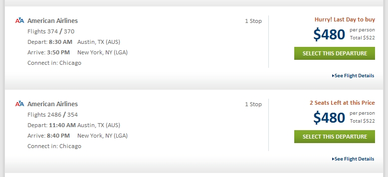
Is there an indication that the action needs to be taken now? The tone of the presentation, offers and deadlines can all influence urgency. I bet you have seen urgency notifications like this before:
It might seem obvious to some and some might think it can’t possibly work, but it does and very, very well. Nothing creates urgency like scarcity.
There’s 2 kinds of of scarcity you can create:
- quantity-related scarcity (2 seats left at this price)
- time-related scarcity (last day to buy)
If the supply of your product is endless, you can give out time-sensitive bonuses, a free gift to first X amount of buyers or a discount if they complete the purchase within a certain time frame.
Word of advice: the reason for scarcity has to be authentic. Do not lie to your customers, ever. If it’s fake scarcity, people will know, and your trustworthiness plummets. It’s not worth it.
Thank you for reading. Until next time.

